
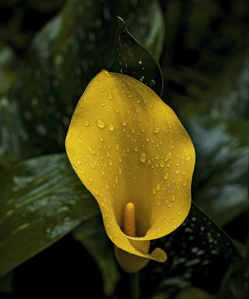
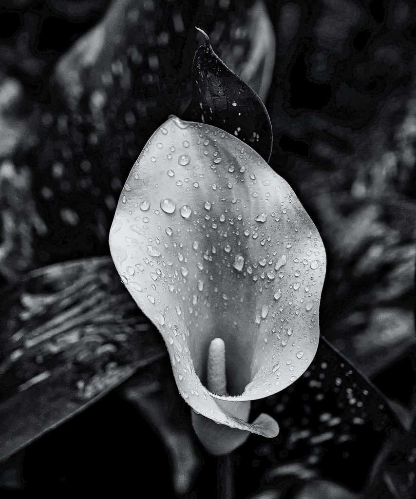
My interest in photographs and photography goes back to the 1950s when I devotedly looked at the photos in National Geographic, Life, Look, and Sports Illustrated magazines. My parents had subscriptions to them and I loved the visual journeys they offered. I was maybe 8 or 9 when I began to really look at photos so that would make it closer to 1960. There were many black and white photos in these magazines but mostly they were color. By the time I went to college I developed a stronger appreciation of the appeal that a striking black and white image can present. I have never lost that connection to black and white photographs. Here is an example of a subject presented in color and black and white with, at least to me, very different visual elements due to the presence of color contrasted by the absence of color. This is a Calla Lily I shot yesterday in the rain. The perfect yellow contrasted by its green leaves and made more interesting with the bearded raindrops hits me with stunning color. It draws the eye in with its bright yellow flag. But what about its form and texture. To me that graceful profile and delicate texture is an afterthought in color but foremost in monochrome. I see the color photo but I feel the black and white through my eyes. Very different visual rewards. Do you prefer one over the other? Which one?